Urlaubspiraten is one of the leading travel deal sites in Germany and expanding worldwide...
WANDERLUST ON A BUDGET
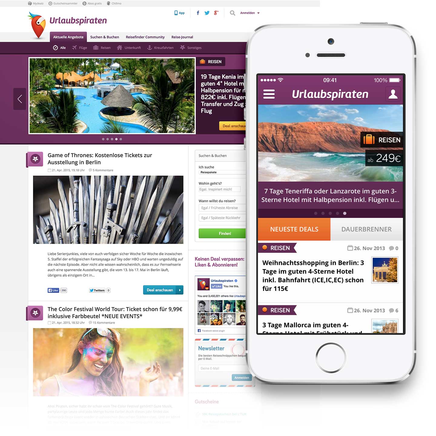
Urlaubspiraten's goal is to provide people with the best deals in the travel & leisure industry, from affordable flights and accommodation to "insider tips and tricks" for the savvy traveler.
THE CHALLENGE
I was responsible for redesigning Urlaubspiraten from a Wordpress blog into a full-blown international product, including branding, information architecture, conceptualization, fully responsive UI/UX design, desktop and iOS app design, illustration, iconography, visual design and, after the product was released, art direction.
As a newborn product in a startup incubator with limited resources, all of this had to be achieved in a tight schedule and fast turnaround pace.
concept and execution
I worked closely with Igor and Sebastian (the company CEOs) in order to understand the inner workings of the industry and the requirements of the product. They were already doing a good job of finding astonishing deals, so the main hurdle for the success of the product was understanding and fixing how people connected with it.
Inside of a market dominated by luxury travel sites and holiday outlets, I had to find the perfect spot where Urlaubspiraten would fit.
My goal was to create a product people would not only enjoy using, but it'd become part of their daily lives and provide them with a joyful experience; something they were so fond of using, they would not doubt recommending it to friends and family.
THE QUALITIES OF DESIGN
One of the most interesting parts of this project was adjusting the brand voice to the expectations of both the owners of the product and the users.
For this, I studied different competitors in the travel industry (both in the luxury and budget level) and the different qualities of their brands and user interfaces, and how they affected the general perception of both the products themselves and the content they presented.
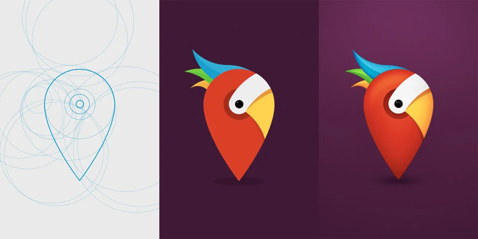
After decoding the positive and negative qualities of those sites, I used all this knowledge to design a new brand which occupied the right position in the market and embodied the values we were aiming for. As with the rest of my work, this is achieved by putting a lot of care into how the different aspects of the design affect the viewer's emotions.
When I work on a product brand, my aim is to create a micro-Universe, an ecosystem which is both instantly recognizable and coherent within itself
INFORMATION ARCHITECTURE, USER FLOWS, AND INTERACTION DESIGN
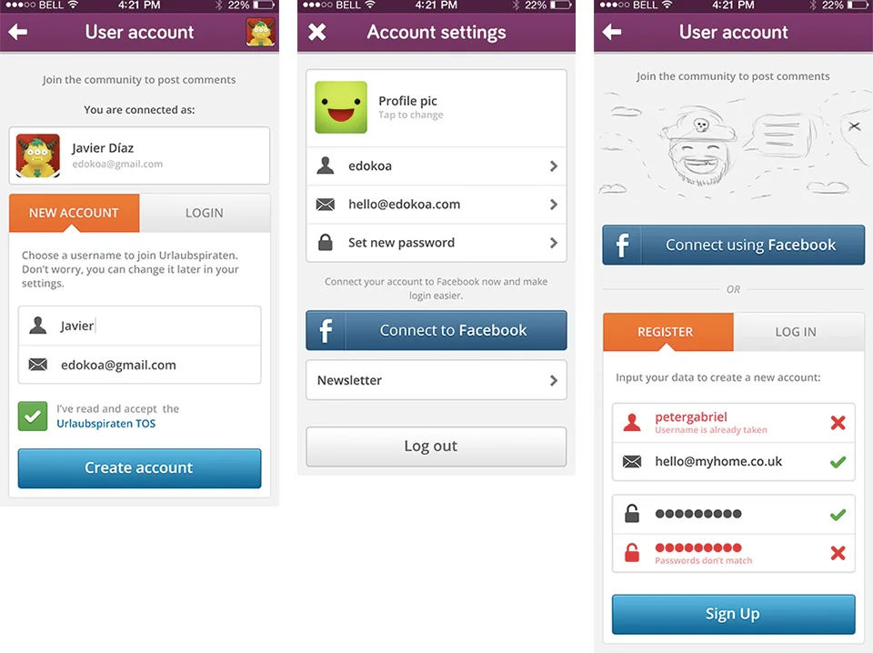
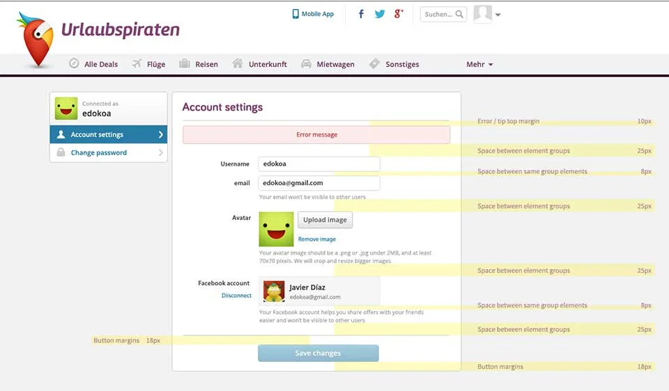
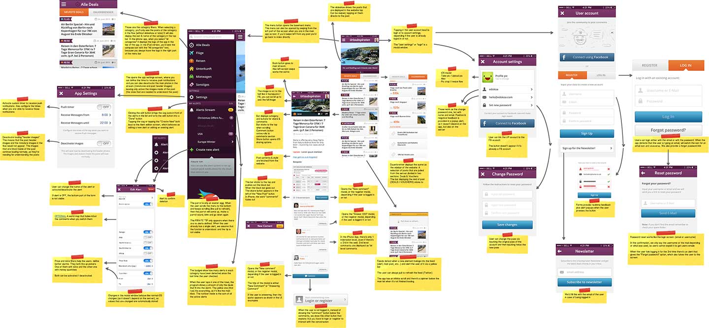
Fancy pixels are useless without a proper User Experience. I always put a lot of care on how a product works and how people feel while using it, as it's the basis of its identity and the decisive factor which decide how happy people are with it, and wether or not they'll adopt it: Organizing every piece of information in a coherent way, displaying proper feedback, designing a solid mental model and finding the most intuitive way of performing actions at hand are only a small part of the UX design process.
Every aspect of Urlaubspiraten has a huge amount of work, thought, and painstaking attention to detail behind it. As it's usually said, this is 99% invisible, but it can be felt throughout the product.

An OUTSTANDING outcome
We released the first version of the redesigned product after three months of hard work. Three months later we introduced new functionalities: A revamped CMS interface to facilitate editors' work, international versions, mobile applications (iPhone / iPad) and, afterwards, a travel deal community where people could enquiry for specific trips and offers or help others. During the first 9 months after the redesign, Urlaubspiraten blew up, growing to a 700% of its previous traffic.
The product has proven to be both easily recognizable and widely appreciated by the general public, and was featured in the March 2015 cover of the FVW Magazine.


